
For many who are new to the world of display measurement, the prevalence of two distinct, but often-interchanged color spaces can be a source of confusion. Since my recent post about the color performance of Apple’s new iPad, a number of people have asked about this topic, so I thought it would be worth a closer look.
In the world of displays and color images, there exists a variety of separate standards for mapping color, CIE 1931 and CIE 1976 being the most popular among them. Despite its age, CIE 1931, named for the year of its adoption, remains a well-worn and familiar shorthand throughout the display industry. As a marketer of high color gamut display components, I can tell you from firsthand experience that CIE 1931 is the primary language of our customers. When a customer tells me that their current display “can do 72% of NTSC,” they implicitly mean 72% of NTSC 1953 color gamut as mapped against CIE 1931.
However, from the SID International Committee for Display Metrology’s (ICDM) recent, authoritative Display Measurement Standard:
“…we strongly encourage people to abandon the use of the 1931 CIE color diagram for determining the color gamut… The 1976 CIE (u’,v’) color diagram should be used instead. Unfortunately, many continue to use the (x,y) chromaticity values and the 1931 diagram for gamut areas.”
So why are there two standards, and why are we trying to declare one of them obsolete? Let me explain.
What is a color space?
First, a little background on color spaces and how they work.
While there are a number of different types of color spaces, we are specifically interested in chromaticity diagrams, which only measure color quality, independent of other factors like luminance. A color space is a uniform representation of visible light. It maps the all of the colors visible to the human eye onto an x-y grid and assigns them measureable values. This allows us to make uniform measurements and comparisons between colors, and offers certainty that images look the same from display to display when used to create color gamut standards.
In 1931, the Commission internationale de l’éclairage or CIE (International Commission on Illumination in English) defined the most commonly used color space. Here’s a look at the anatomy of the CIE 1931 color space:

What makes a good color space?
An effective color space should map with reasonable accuracy and consistancy to the human perception of color. Content creators want to be sure that the color they see on their display is the same color you see on your display.
This is where the CIE 1931 standard falls apart. Based on the work of David MacAdam in the 1940’s, we learn that the variance in percieved color, when mapped in the CIE 1931 color space, is not linear from color to color. In other words, if you show a group of people the same green, then map what they see against the CIE 1931 color space, they will report seeing a wide decprepancy of different hues of green. However, if you show the same group a blue image, there will be much more agreement on what color blue they are seeing. This uneveness creates problems when trying to make uniform measurements with CIE 1931.
The result of MacAdam’s work is visualized by the MacAdam Elipses. Each elipse represents the range of colors respondents reported seeing when shown a single color, which was the dot in the center of each elipse:

A better standard
It was not until 1976 that the CIE was able to settle on a significantly more linear color space. If we reproduce MacAdam’s work using the new standard, variations in percieve color are minimalized and the MacAdam’s Elipses mapped on a 1976 CIE diagram appear much more evenly sized and circular, as opposed to oblong. This makes color comparisons using CIE 1976 significantly more meaningful.
The difference of the CIE 1976 color space, particularly in blue and green, is immediately apparent. As an example, lets look at the color gamut measurements of the iPad 2 and new iPad we used in an earlier article. Both charts do a reasonably good job of conveying the new iPad’s increased gamut coverage at all three primaries. But, the 1976 chart captures the dramatic perceptual difference in blue (from aqua to deep blue) that you actually see when looking at the displays side by side:

The increased gamut of the new iPad is worth testing. Next time you find yourself in an Apple store, grab an iPad 2, hold it alongside a new iPad, Google up a color bar image and see the difference for yourself.
So, why do we still use CIE 1931 at all? The only real answer is that old habits die hard. The industry has relied on CIE 1931 since its inception, and change is coming slowly.
Fortunately, CIE 1931’s grip is loosening over time. The ICDM’s new measurement standard should eventually force all remaining stragglers to switch over to the more accurate 1976 standard. Until then, you can familiarize yourself with a decent color space conversion calculator, such as the handy converter we built just for this purpose:

Pingback: Can my TV accurately display my favorite NFL team’s colors? | dot color
Mr Jeff,
You live in the world of emissive color (displays), and I live in the world of reflective color (print). In your world, the chromaticity diagrams are all the rage. In my world, we believe in CIELAB. Why the difference?
On the one hand, the eye can’t tell whether or not a photon bounced off a surface before entering the eye. So why should there be any difference in color counting technology?
On the other hand, there are some differences. In my world, there is a mostly strict limit to how many photons are available. Objects just don’t routinely look whiter than white. In your world, well, you can just turn the volume of the light up to eleven.
In your world, the chromaticy stuff makes a lot of sense because the edges of gamuts are straight lines and you can measure the size of the gamut easily. In my (CMYK) world, the edge of the gamut is a squirrely mess.
Any thoughts on this? Why are you and I using different color spaces?
John
Great question. In fact, this is one of the things that drew me to your post on the use of RGB primary nomenclature by print guys (who actually work with CMY primaries).
Luminance certainly does matter as much, or more maybe as you hint above, in the display world since its subject to more manipulation.
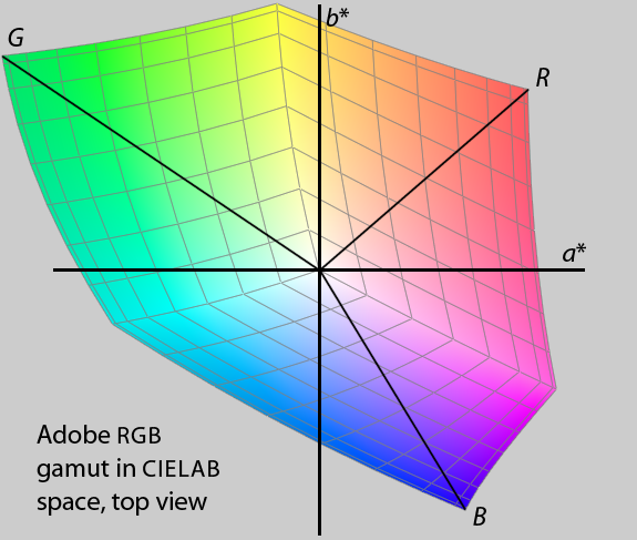
Looking at typical display gamuts in CIELAB also reveals that there’s much more going on than the three primary coordinates would have you believe (though certainly not as wild a picture as some printer gamuts). You can certainly have “out of gamut” colors that appear to be well within the confines of the 2D gamut plot. Here’s Adobe RGB in CIELAB as an example:
The only conclusion I can really come to is that tradition and habit play major roles. As I said in the post above, we in the display industry still talk in terms of CIE 1931 every day. As much as we can all agree that the 80+ year old standard is too non-linear to be useful for the evaluation of display performance, we just can’t get away from it!
Dear Jeff,
I learned a lot from your explanations; still I do not catch the complete picture I guess…
The question that burns the most in my mind is:
Suppose a display manufacturer wants to make a display based on 3 colors and wants to have the largest gamut….. Would it not be best to pick 3 colors that are located as far apart as possible in the diagram? Lets say 450, 520 and 700 nm?Is this reasoning correct, but is it difficult to get monochromatic light sources, or is my understanding of the matter still lousy?
Regards,
Joeke Noordhuis
Hi Joeke,
Great question and John’s answer is pretty much right on I’d say- it’s all about energy and display brightness.
You may be interested in the rec.2020 spec that is being proposed for UHDTV broadcast. This spec uses a very wide gamut, almost along the lines of what you describe. I wrote about it last year here: http://dot-color.com/2012/12/04/so-you-bought-a-4k-tv-now-where-is-the-4k-content/
This standard cannot be achieved without laser or maybe quantum dot backlight technologies.
Hi Jeff,
Thanks your good article, i’d love it much. Now I have to review some modern smartphone’s display, so how to get their color gamut? What’s app/device to get display color gamut? Please let’s me know it. Thanks for help and support.
Mr. Elpvn
elpvn@inbox.com
Hi Elpvn, we use an expensive spectroradiometer to take these measurements however there are several lower cost colorimeter products from companies like X-Rite that should get the job done for you.
Thanks Jeff so much, so which product of X-Rite I need to get for smartphone test? Coz I think i1Display Pro not for mobile device test (their software not support?).
P/S: I’m from Ho Chi Minh city, Vietnam ^^
Thanks again for fast feedback.
Mr. Elpvn
elpvn@inbox.com
I’m not quite sure which one would be best for you. You are right that you won’t be able to control the colorimeter from the smartphone itself but you may be able to run their software in “manual” mode and simply measure colors on the display one by one. You may also want to look at some of the calibration and test products from SpectraCal.
Hello Joeke,
What you are suggesting is sound, just not terribly feasible. IF power were not a concern, you could get a huge gamut with three monochromatic light sources as you have suggested. But there are two little problems.
The first problem is that our eye is not particularly sensitive to light around 400 – 450 nm or getting up close to 700 nm. You would consume a lot of watts of power to get the display bright enough.
The second problem lies in how you create that monochromatic light. If you start with LEDs (either white or RGB), you need to pass the light through filters in order to get close to monochromatic light. This can be done, interference filters can be made that pass very narrow ranges of light. The narrower the band pass (that is, the closer you get to monochromatic light), the closer you get to the outer edge of the horseshoe in the chromaticity diagram, which is what you want. That’s good, but the narrower the bandpass, the more light you need to throw away. This is somewhat more of a problem with white LEDs than RGB LEDs, but it is an issue for either. There is a fundamental tradeoff between three things: a bright display, a display that has a big color gamut, and having a display that consumes lots of power.
It is theoretically possible to build a “flying spot” display that uses three lasers that are rastered across a screen via spinning mirrors and that are modulated to create the picture. Being lasers, they would be very pure in color. I am not aware of anyone who has built such a thing. Might be fun, though!
John
Pingback: Google claims new Nexus 7 delivers 30% wider range of colors – what do they mean? | dot color
Thanks for finally talking about >Color Space Confusion | dot color <Liked it!
Pingback: Are tennis balls yellow or green? | dot color
hi,How to covent CIE1931 to CIE1976 with the Calculate.xls ? plase reply me ,thank you and love you 😀
Just enter CIE 1931 values in the “input” section highlighted in yellow (columns B-C, rows 6-8). Calculated CIE1976 values will appear in the blue highlighted “output” area (columns B-C, rows 15-17).
You can ignore the “red,” “green” and “blue” labels and simply enter any arbitrary xy coordinates into the input.