Seeing red: can color change your spending habits?

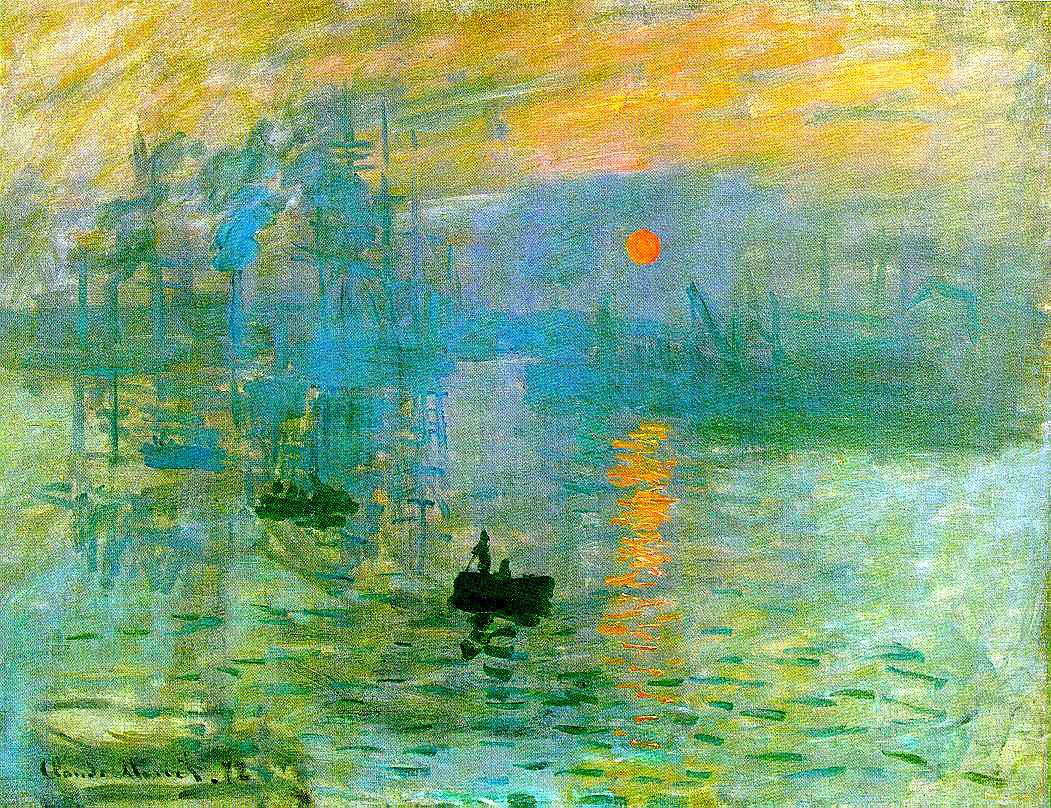
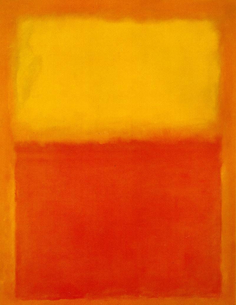
Color can have a powerful physiological effect on us. This should come as no surprise to anyone who’s ever been wowed by a Monet or a Rothko. But color can affect us in ways you never imagined. Recent studies suggest that that the color of a uniform can affect the outcome of an Olympic wrestling match and onscreen colors can influence how much you pay for something on eBay.

In one study, researchers found that Olympic wrestlers wearing red won as much as 60% of the time, even against evenly matched opponents (who wore a different color).

US Wrestler Jake Varner (red) on his way to defeating Valerie Andriisteve of Ukraine in the 96-kg freestyle wrestling gold match in London. Credit: The ASSOCIATED PRESS

Similarly, in a Journal of Consumer Research study on the impact of color on consumers who buy items on auction sites like eBay, authors Rajesh Bagchi and Amar Cheema found that “red background color induces aggression through a feeling of arousal and it increases aggression relative to blue or gray backgrounds. This causes individuals to make higher bids in auctions but lower offers in negotiations.”

Why? The exact mechanism remains a mystery but researchers see some evidence that aggressive colors like red may actually cause a spike in testosterone levels.

I find it particularly fascinating that color choice did not specifically correlate to the price someone paid for an item. Instead, the colors drove more or less aggressive behavior, which lead participants to either seek the best deal possible against a salesperson or to beat out competing bids in an auction.

It got me wondering how retailers might be using color to influence purchasing. A quick survey of some popular online shopping destinations yielded potentially interesting results. Since product background is not always in the control of the retailer, I looked at the “add to cart” areas of three popular online retailers: Apple, Amazon and eBay.

All three employ a lot of blue, a calming color, in their ‘add to cart’ areas. Apple uses a shade of green, another calming color, for the “add to cart” button. Amazon lists the price in a dark red, while Apple uses a lighter shade to accentuate free shipping.

Next time you find yourself shopping either online or brick and mortar, take note of the colors around you – you may be surprised by how far your environment is being manipulated to get you to pay more.

Even on Mars, color matters

One of the most important pieces of equipment on the Curiosity rover is not a spectrometer or a laser but a color calibration chart. Nothing is simple when you’re sending a robot on a 354 million mile journey into space, but NASA and Bill Nye (yes, the “science guy”) came up with an ingenious solution to calibrate the colors of the onboard cameras.

In order for NASA scientists to be sure that we are seeing “The Red Planet“ in the correct shade of red, they attached red, green and blue color chips to a sundial on the surface of the rover. These reference colors will guarantee the amazing photos we are seeing of the Martian landscape are accurate.

Here is an animated gif of the sundial on the surface of Mars and a close-up shot of it before it left Earth:

Can your TV accurately display your favorite NFL team’s colors?

Over the weekend I saw this interesting tweet about color gamut and the NFL and I had to find out if it was true:

Could it be that something as simple as an NFL jersey is not within the color gamut of modern HDTVs? I mapped the Broncos team colors onto the CIE 1976 color space along with the HDTV color gamut standard, called rec.709. As you can see, the orange is right on the edge and the blue is indeed outside the gamut.

When we think of high color content, we think of action movies and video games, but this exemplifies how color performance affects everything we see on our TVs, even down to the jersey being worn by our favorite sports team. Luckily high color displays are on their way to fix this problem.  As you can see, the Bronco’s colors fall nicely within the much wider DCI-P3 color gamut.

Is creativity the next killer mobile app?

Since the debut of the iPad in 2010, tablets have become the ultimate content consumption device, but many still to wonder if they’ll ever be capable of replacing notebooks for portable content creation.

While tablets may never truly replace notebooks for all of our content creation needs, especially typing intensive ones, a new crop of apps for iOS and Android are certainly making a case for it.

A little doodle made with the glorious new #Paper app for the iPad from @FiftyThree

(via Brian Taylor from CandyKiller: A little doodle made with the glorious new #Paper app)

Recent creative apps like Paper by fiftythree, Adobe’s Photoshop Touch and Apple’s iPhoto for iOS have just started to scratch the surface of the creative capabilities of powerful mobile devices. These apps show us that mobile creativity, when done right, can harness the unique properties of a touchscreen handheld device to offer new capabilities that a laptop cannot duplicate. Drawing with a stylus in Paper, for example, feels remarkably precise and expressive because of a neat gesture trick- the speed of your pen controls the thickness of the line. Similarly, in Photoshop Touch and iPhoto, editing your photos by actually putting your hands on them, while less precise than a keyboard and mouse, can be a revelation for broad stroke tasks like blending two images.

Tablets clearly have the processing power, the battery life and display resolution necessary to become serious creative tools, but there’s one thing missing: color. Creative professionals normally work on displays capable of showing a range of colors that is as much as 60% wider than even the latest “high color saturation” iPad. Artists need to see the content they are creating in the same vibrant colors they see in the real world.  Improving the color performance on mobile devices will make tablets truly worthy of a place in any creative professional’s regular workflow.